Audio By Carbonatix

Getty Image
- Vanderbilt University has a new logo.
- It’s safe to say that most people don’t like the new look for the Commodores.
- Be sure to check out more sports stories at BroBible here.
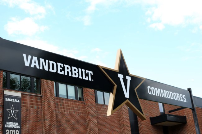
Vanderbilt University had one of the most recognizable – and in my opinion one of the coolest – logos in college athletics with the star encasing a ‘V.’ The keyword in that previous sentence is ‘had’ because now the Commodores have an extremely boring logo.
The university unveiled its new logo on Tuesday completely getting rid of the star while presenting a bland new ‘V’ you’d likely see on an old Madden video game when creating a team.
According to the university, Vanderbilt’s new logo comes after two years of research.
“Updates on the Vanderbilt identity come after extensive input from across the community, with more than 500 completed surveys, 70-plus one-on-one interviews and dozens of workshops and group engagement sessions conducted during the past two years.”
Over 500 surveys, and this is the new logo the school came up with:
New profile pic, who dis?#VandyUnited | #AnchorDown pic.twitter.com/OdqhvcmdBo
— Vanderbilt Football (@VandyFootball) March 22, 2022
This photo of head basketball Jerry Stackhouse wearing a hat with the new logo, and a vest with the old log, shows just how much better the old logo actually looks. The giant star with a ‘v’ in the middle behind Stackhouse looks great, the new logo, not so much.
https://twitter.com/jerrystackhouse/status/1506290901286637579?s=20&t=ZJMGBWzahLnx922s6s9-qw
As you would imagine, people on social media had a field day reacting to Vandy’s new logo:
I don’t think I am exaggerating when I say Vanderbilt’s logo was the best thing about Vanderbilt athletics and they got rid of it https://t.co/LTKkoJJDsC
— Rodger Sherman (@rodger) March 22, 2022
New Vanderbilt logo looks like the History Channel and Virginia logo had a child. pic.twitter.com/LSqvjpjFx3
— Owen (@75toRupp) March 22, 2022
https://twitter.com/supercollateral/status/1506337240116568064?s=20&t=ZJMGBWzahLnx922s6s9-qw
RIP to Vanderbilt's "Star V" logo, which will be replaced by the "Goofy Block V" starting in 2023 https://t.co/6mbdw4GfOO pic.twitter.com/zns386kzCy
— Simon Gibbs (@SimonGibbs26) March 22, 2022
the new Vanderbilt logo pic.twitter.com/Cza0QVXUyF
— Luke 🤠 (@lukiewookiee) March 22, 2022
I cannot get over how terrible Vanderbilt's rebrand is. Somebody got paid a massive sum of money to make all of Vandy's stuff way worse! pic.twitter.com/WEqvqPG8PB
— Kyle Tucker (@KyleTucker_ATH) March 22, 2022